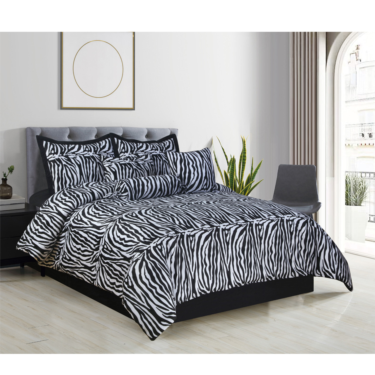
Walk into any big-box home store and you'll see them. The stripes. They’re loud. They’re high-contrast. They’re unmistakably wild. Choosing a zebra print comforter set is basically a personality test for your bedroom, and honestly, most people fail it. They buy the set, throw it on the bed, and suddenly the room feels like a 2004 dorm room or a frantic safari themed gift shop. It’s a mess.
But it doesn't have to be.
Zebra print is a classic. It’s been a staple in high-end interior design for decades, used by legends like Madeleine Castaing or Tony Duquette to add a "jungle chic" flair to sophisticated spaces. The problem isn't the pattern; it's the execution. If you’re looking to upgrade your sleep space with these iconic black and white ripples, you have to understand the balance between "luxury hotel" and "cluttered chaos."
The Science of Visual Weight in Small Spaces
Why does a zebra print comforter set feel so overwhelming? It’s about visual weight. Human eyes are naturally drawn to high contrast. Black on white is the highest contrast possible. When you put that on a king-sized bed, it becomes the only thing anyone sees. In a small room, this can actually make the walls feel like they’re closing in.
Interior designer Kelly Wearstler often talks about the importance of scale. If the "stripes" on your comforter are too large, they swallow the room. If they’re too small and busy, they create a vibrating effect that’s actually pretty stressful to look at before you go to sleep. You want a "medium-scale" organic line. Real zebras don't have perfect, symmetrical stripes. Your bedding shouldn't either. Look for sets where the lines vary in thickness. This mimics nature and feels much more expensive than a repetitive, computer-generated pattern.
Material Matters More Than the Print
You can find a polyester zebra print comforter for twenty bucks. Don't buy it. Polyester has a specific "sheen" that makes animal prints look cheap and tacky. It catches the light in a way that screams "synthetic."
If you want this look to work, you need matte fabrics.
- Cotton Sateen: Gives a slight, sophisticated glow without being shiny.
- Linen: This is the pro move. The natural texture of linen softens the harshness of the black and white stripes. It makes the bed look lived-in and breezy rather than stiff.
- Tufted Chenille: Some modern sets use raised black texture on a white base. This adds a 3D element that breaks up the visual intensity.
How to Style a Zebra Print Comforter Set Without Losing Your Mind
Most people make the mistake of "matching." They get the zebra comforter, then the zebra pillows, then a zebra rug. Stop. Just stop.
The secret to using a bold animal print is the "60-30-10" rule, but with a twist. Your zebra print is your 10% accent, even if it covers the whole bed. To balance it, the rest of the room needs to be incredibly grounded. Think about "visual breathing room." If your bed is loud, your walls should be silent. A deep charcoal or a warm "greige" (like Sherwin-Williams' Agreeable Gray) works wonders.
Actually, try adding wood. Real wood. A walnut headboard or oak nightstands provide an organic warmth that tames the "wildness" of the print.
The Color Palette Trap
Don't just stick to black and white. While the traditional zebra print comforter set is monochrome, some of the most successful designs use "off-colors."
- Chocolate and Cream: Much softer on the eyes. It feels more "safari lodge" and less "nightclub."
- Indigo and White: A coastal take on the trend.
- Muted Grey and Silver: Great for modern, minimalist apartments.
If you are sticking with the classic black and white, you need a "pop" color to anchor the room. Not red—unless you want your room to look like a 1980s Valentine’s Day card. Try emerald green or a dusty mustard yellow. A single velvet pillow in one of these tones suddenly makes the zebra print look intentional and curated.
Quality Indicators: What to Look for Before Buying
When you’re browsing online, every photo looks the same. They’re all photoshopped onto a bed in a fake room. You have to look at the specs.
First, check the "Thread Count," but don't obsess over it. For a comforter, the "fill power" or "GSM" (grams per square meter) is more important for the "loft" or puffiness. A flat zebra comforter looks sad. You want something with at least 250-300 GSM so it has enough body to show off the pattern.
Second, look at the stitching. Box-stitch construction is vital. It keeps the filling from bunching up in the corners. There is nothing worse than a zebra print comforter that has a huge lump of polyester at the feet and nothing at the top.
Care and Longevity
Black fades. That’s the reality. To keep your set looking "designer" rather than "disaster," you have to wash it correctly.
- Turn the duvet cover or comforter inside out.
- Use cold water. Always.
- Add a cup of white vinegar to the first wash; it helps "set" the black dye.
- Avoid the dryer if you can. If you can't, use the lowest heat setting. High heat makes the fibers "frizz," which dulls the sharpness of the print.
Common Misconceptions About Animal Prints
People think zebra print is "feminine" or "glam." It can be, sure. But it’s actually one of the most gender-neutral patterns in history. It’s basically just a variation of a stripe. In a maximalist "gentleman’s library" style room with leather chairs and brass lamps, a zebra print comforter looks incredibly masculine and bold.
Another myth? That it goes out of style. Trends cycle, but animal prints are "neutrals" in the fashion world. Look at Diane von Furstenberg. She’s been using these prints since the 70s. The trick is to avoid "trendy" shapes. Stick to a classic comforter or duvet. Avoid ruffled edges or sequined accents. Keep the silhouette clean, and the print will stay timeless.
Taking the Leap
If you’re on the fence, start small. You don't have to buy the 12-piece "bed in a bag." Buy a high-quality zebra duvet cover. Put it over your existing insert. If it feels like too much after a week, you can fold it at the foot of the bed as an accent "runner." This is actually how many top-tier designers use the print. It gives you the texture and the "wow" factor without the commitment of a full-scale pattern takeover.
Check your lighting too. High-contrast prints look different under 2700K (warm) bulbs versus 5000K (daylight) bulbs. In warm light, the white parts of the zebra print might look yellowish. If you want that crisp, high-fashion look, look for "Cool White" LED bulbs. It makes the black pop and the white look like fresh snow.
Actionable Next Steps for Your Bedroom Makeover
Ready to commit to the stripes? Here is exactly how to execute the look without regret:
- Measure your bed height: Animal prints look best when they drape significantly over the sides. If you have a deep mattress, buy one size up (a King comforter for a Queen bed).
- Audit your current decor: Remove any other busy patterns. Plaid, paisley, and floral should generally stay away from zebra unless you are a professional maximalist.
- Focus on texture: Order at least two solid-colored textured pillows (think waffle weave or faux fur) to sit in front of the zebra shams. This "breaks up" the pattern.
- Assess the floor: If you have a busy carpet, skip the zebra comforter. It will clash. Zebra works best on hardwood, tile, or solid-colored rugs.
- Set a budget for "The Middle": Avoid the $30 sets and the $1,000 designer labels. The $120 to $250 range is where you find the best balance of long-staple cotton and durable reactive dyes that won't bleed in the wash.