Ever looked at a piece of antique porcelain and wondered why that specific blue looks like it’s vibrating? It isn’t just "dark blue." It’s Zaffre. Most people have never even heard the word, but they've seen it staring back at them from museum displays or high-end cobalt glass.
Zaffre is a heavy-hitter. It's an intense, deep blue pigment produced by roasting cobalt ore. It’s the raw, gritty ancestor of what we now call cobalt blue. While modern artists can just squeeze a tube of paint, the history of Zaffre is actually kinda messy and full of industrial secrets. It isn't just a color; it’s a chemical state.
What Zaffre Actually Is (And What It Isn't)
Technically, Zaffre is an impure form of cobalt oxide. It's what you get when you take cobalt ore—usually smaltite or cobaltite—and roast it in a furnace to get rid of the sulfur and arsenic. You're left with a dark, crumbly powder. In the 17th and 18th centuries, this was a massive trade commodity.
People often mix it up with smalt. They aren't the same. Smalt is what happens when you take Zaffre and melt it into glass, then grind that glass into a powder for painters. Zaffre is the intermediate step. It’s the concentrate. Think of it like espresso versus a latte.
One of the weirdest things about Zaffre is how it reacts to heat. It’s incredibly stable. That's why it became the gold standard for ceramics. When you fire a kiln at 2,000 degrees, most colors just burn away or turn a muddy gray. Not Zaffre. It stays vibrant. It bites into the glaze. This is why Ming Dynasty pottery or Delftware still looks so punchy after five hundred years. The blue hasn't faded. It’s literally fused into the structure of the ceramic.
The Secretive History of Cobalt Blue
Back in the day, if you knew how to make high-quality Zaffre, you were basically printing money. The Germans had a near-monopoly on it for a long time. The mines in the Erzgebirge mountains were the primary source. Miners there actually hated the ore at first. They called it kobold, named after troublesome earth spirits, because the ore was difficult to smelt and released toxic arsenic fumes that made the miners sick.
Basically, they thought the ore was cursed.
Eventually, glassmakers realized that this "cursed" rock produced the most divine blue imaginable. By the 1500s, it was being shipped across Europe and even into Asia. If you look at Persian tiles or Chinese blue-and-white porcelain from certain eras, you’re looking at Zaffre that likely traveled thousands of miles across the Silk Road. It was a global currency before we really had a global economy.
Why You Don't See the Word "Zaffre" on Paint Tubes
If you go to a local art supply store today, you won't find a tube labeled "Zaffre." You'll see Cobalt Blue, Ultramarine, or maybe Prussian Blue. Why did the name disappear?
Chemical refinement changed everything.
In the early 1800s, a French chemist named Louis Jacques Thénard discovered a way to make a much cleaner, more consistent cobalt blue by reacting cobalt oxide with aluminum. This "Thénard's Blue" replaced the old, grittier Zaffre-based pigments. Modern synthetic blues are cheaper to make and safer to handle because they don't contain the leftover arsenic that the old-school Zaffre did.
So, Zaffre moved from the art studio to the history book. Today, the term is mostly used by mineralogists, historians, and high-end ceramicists who are trying to recreate historical glazes. It’s a "heritage" color.
The Psychology of Zaffre
Colors do things to our brains. Zaffre is a "high-energy" dark blue. Unlike Navy, which feels conservative and quiet, Zaffre has a slight violet undertone that makes it feel electric.
- Reliability: It feels permanent because, historically, it was.
- Wealth: For centuries, owning something this color meant you had access to imported luxury goods.
- Depth: It has a "bottomless" quality that makes it popular in interior design for accent walls or high-gloss cabinetry.
Using Zaffre in Modern Design and Decor
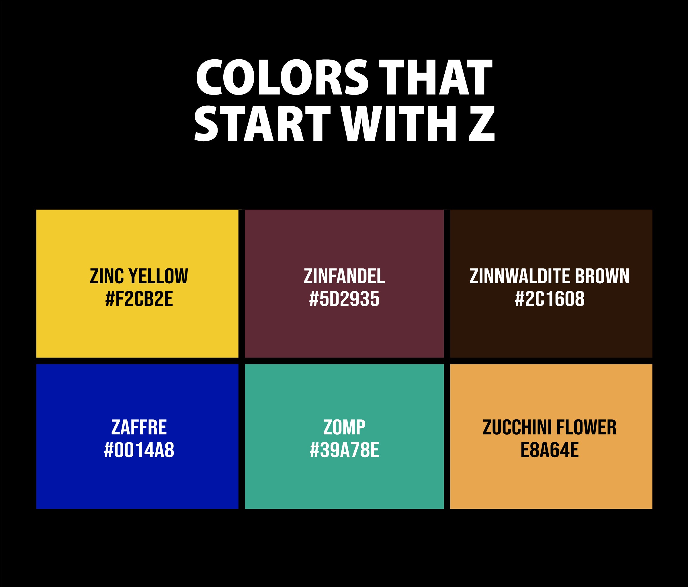
You don't need to roast cobalt ore in your backyard to use this color. In modern hex codes, Zaffre is roughly represented by #0014A8. It’s a very saturated, dark blue that sits right on the edge of the web-safe color palette.
If you’re trying to use this in your home, don't overdo it. Because it’s so saturated, it can swallow the light in a room. It works best when paired with high-contrast elements. Think crisp white crown molding or warm brass hardware. The brass especially pops against Zaffre because the yellow in the metal is the complementary opposite of the blue.
Actually, Zaffre is a great choice for a front door. It’s more interesting than black but feels more "expensive" than a standard royal blue. It says you know what you’re doing. It’s sophisticated but has a bit of an edge.
Common Misconceptions About the Color
- It’s just a fancy name for Navy. Nope. Navy has a lot of black or gray in it. Zaffre is pure saturation. If you put them side-by-side, Navy looks dull and Zaffre looks like it’s glowing.
- It’s named after a person. People often think "Zaffre" is a French surname. It’s actually derived from the Arabic word zafira or the Latin sapphirus, both related to sapphires.
- It’s toxic. Modern digital or synthetic versions of the color are perfectly safe. However, historical Zaffre powder was indeed pretty nasty stuff due to the arsenic content. Don't go licking 17th-century pigment jars.
Where to See Real Zaffre Today
If you want to see the real deal, skip the paint store and go to a museum. Look for:
- The Victoria and Albert Museum (London): Their collection of Chinese export porcelain features Zaffre that hasn't lost a bit of its intensity since the 1600s.
- Delft, Netherlands: The traditional "Delft Blue" pottery still uses cobalt-based pigments that are the direct descendants of Zaffre.
- Chartres Cathedral (France): Some of the blues in the stained glass windows are legendary. While many use different copper-based recipes, the depth of the "Chartres Blue" is the spiritual cousin to Zaffre.
Practical Steps for Designers and Collectors
If you’re a creator or a collector, Zaffre offers a level of depth that modern "flat" colors just can't match. Here is how to work with it:
For Interior Design: Use a high-gloss finish. Zaffre needs reflection to show off its range. In a matte finish, it can look a bit like a bruise. In a high-gloss or "lacquered" finish, it looks like deep water.
** For Digital Artists:** When working in RGB, keep your Red and Green values very low (near 0) and your Blue value high (around 160-170). This creates that specific "electric" dark blue that characterizes Zaffre without it veering into purple.
For Ceramicists: Look for "Cobalt Carbonate" or "Cobalt Oxide" washes. If you’re trying to get that Zaffre look, apply the wash unevenly. The beauty of the old pigment was its lack of uniformity—the tiny specks of impurities actually gave the blue its character and "vibration."
For Antique Collectors: When inspecting blue-and-white porcelain, look at the edges of the blue areas. Real Zaffre glazes often have a "halo" effect where the color has bled slightly into the white glaze during firing. This "feathering" is a sign of authentic high-cobalt pigment rather than modern printed decals.
Zaffre is a reminder that color used to be a physical, dangerous, and expensive thing. It wasn't just a choice on a dropdown menu. It was a rock, pulled from a toxic mine, roasted in a fire, and shipped across oceans. Next time you see that specific, vibrating blue, you'll know it's not just blue—it's the survivor of a 500-year-old chemical process.