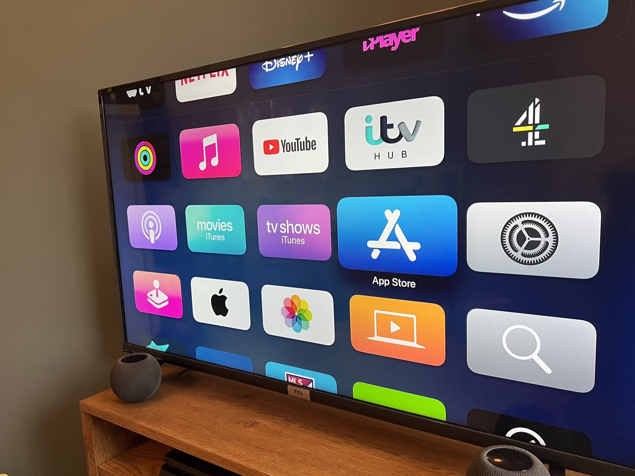
The Apple TV home screen is a bit of a trick. At first glance, it looks like a simple grid of apps, exactly like the iPad or iPhone you probably have in your pocket. But that’s where most people stop exploring, and frankly, it’s why so many users feel like the tvOS experience is "just okay" compared to the dirt-cheap Roku or Fire Stick they used to own.
It's actually a deeply customizable engine.
Apple’s philosophy with the Apple TV home screen is subtly different from its mobile counterparts. While an iPhone is a tool for individual task management, the TV is a communal portal. If yours is cluttered with apps you haven't opened since 2022, you're doing it wrong. Honestly, the default layout is kind of a mess. It pushes Apple’s own services—Apple TV+, Music, Photos—into the top row, regardless of whether you actually subscribe to them.
The Power of the Top Shelf
Let’s talk about the "Top Shelf." This is the single most important real estate on your television. Most people treat it like a wallpaper zone, but it’s actually a dynamic data feed.
When you move an app into the very top row of your Apple TV home screen, it gains special powers. If you put Netflix there, it stays static (Netflix famously refuses to play nice with Apple’s deeper integration features). But if you put the Apple TV app, Hulu, or YouTube there, the space above the icons transforms. You get a rotating preview of "Up Next" content or trending videos.
You can jump straight into the latest episode of Severance without even clicking into the app first. This saves maybe four or five clicks. Over a year? That’s hours of your life back.
To move an app, just hover over it, hold down the center of your clickpad until the icon starts jiggling, and slide it up. If an app doesn’t support Top Shelf features, it’s basically wasting that prime space. Get it out of there. Move it to a folder or the bottom of the list.
Why Folders are Your Best Friend (And Your Worst Enemy)
Categorization is a trap. You think you’re being organized by creating a "Streaming" folder, a "Games" folder, and a "Sports" folder. You aren't.
Every time you put an app inside a folder, you’re adding a physical barrier between you and your entertainment. The Apple TV home screen works best when it’s lean. I’ve seen setups with 60 apps spread across five screens. It’s a nightmare to navigate with a remote.
Instead, try the "Rule of Ten." Keep your ten most-used apps on the main screen. Everything else—that random fitness app you used once, the niche documentary service, the settings gear—should be banished into a single folder at the very bottom.
- Select an app.
- Make it jiggle.
- Hover it over another app to create a folder.
Name it something like "The Vault" or just "Apps." Keep your main view clean. It makes the whole experience feel premium, like a high-end hotel interface rather than a cluttered digital junk drawer.
The "Up Next" Problem
There’s a massive misconception about the "Up Next" queue. People think it’s just a history list. It’s not. It’s a cross-platform aggregator, except for the holdouts. Netflix is the big one here. They want you in their walled garden, so they won't let their shows appear in the Apple TV "Up Next" row.
This creates a fragmented Apple TV home screen experience. You’ll see your Disney+ shows and your HBO (Max) shows in the top shelf, but you’ll have to manually dive into Netflix to see where you left off in Stranger Things.
It’s annoying.
However, for everything else, "Up Next" is a miracle. If you’re watching a series on Amazon Prime, it’ll pop up right there on the home screen when a new episode drops. You don't even need to remember what night the show airs.
Managing Privacy on the Big Screen
Since the TV is often in a living room, privacy matters. You might not want your "Up Next" list showing your secret reality TV obsession to everyone who walks by. You can actually turn off these previews in the settings. Go to Settings > Apps > TV and toggle the "Home Screen" setting from "Up Next" to "What to Watch." This switches the Top Shelf from your personal history to a generic list of trending shows.
It’s a small change, but it makes the Apple TV home screen feel much more "public-friendly" if you host a lot of guests.
Dark Mode vs. Light Mode
Apple introduced an automatic switching feature for the appearance of the UI. Most people leave it on "Light," which is fine during the day. But at 11:00 PM? It’s like staring into a flashlight.
Go to Settings > General > Appearance. Set it to "Automatic."
Your Apple TV home screen will now shift from a crisp, white aesthetic during the day to a deep, charcoal grey after sunset. It’s easier on the eyes and, frankly, looks way cooler. The posters for movies and TV shows pop much more against the dark background.
The Mystery of the "Home" Button
Depending on your settings, the TV button on your Siri Remote (the one that looks like a little screen) does one of two things. It either takes you to the Apple TV home screen or it takes you into the Apple TV App.
This is a huge point of frustration for new users.
If you want the button to always take you back to your grid of icons, go to Settings > Remotes and Devices and change the "TV Button" behavior. Most power users prefer it to go straight to the Home Screen. It’s more predictable.
Practical Optimization Steps
If you want to actually fix your setup right now, do this:
- Audit your Top Row: Put the Apple TV app, YouTube, and your most-used "friendly" streamer (like Hulu or Disney+) there.
- Delete the Bloat: If you haven't opened an app in a month, delete it. You can always redownload it from the App Store in thirty seconds.
- Use the Sidebars: In the Apple TV app itself, which often acts as a secondary home screen, use the sidebar to quickly jump between libraries.
- Sync your screens: If you have multiple Apple TVs in the house, turn on "One Home Screen" in the iCloud settings. This ensures that when you move an app on the living room TV, it moves on the bedroom TV too.
The Apple TV home screen is only as good as you make it. It’s a tool for curation. By cutting the noise and leaning into the Top Shelf features, you turn a standard streaming box into a personalized media command center. Stop scrolling past rows of icons you don't use and start treating that top row like the high-value real estate it is.