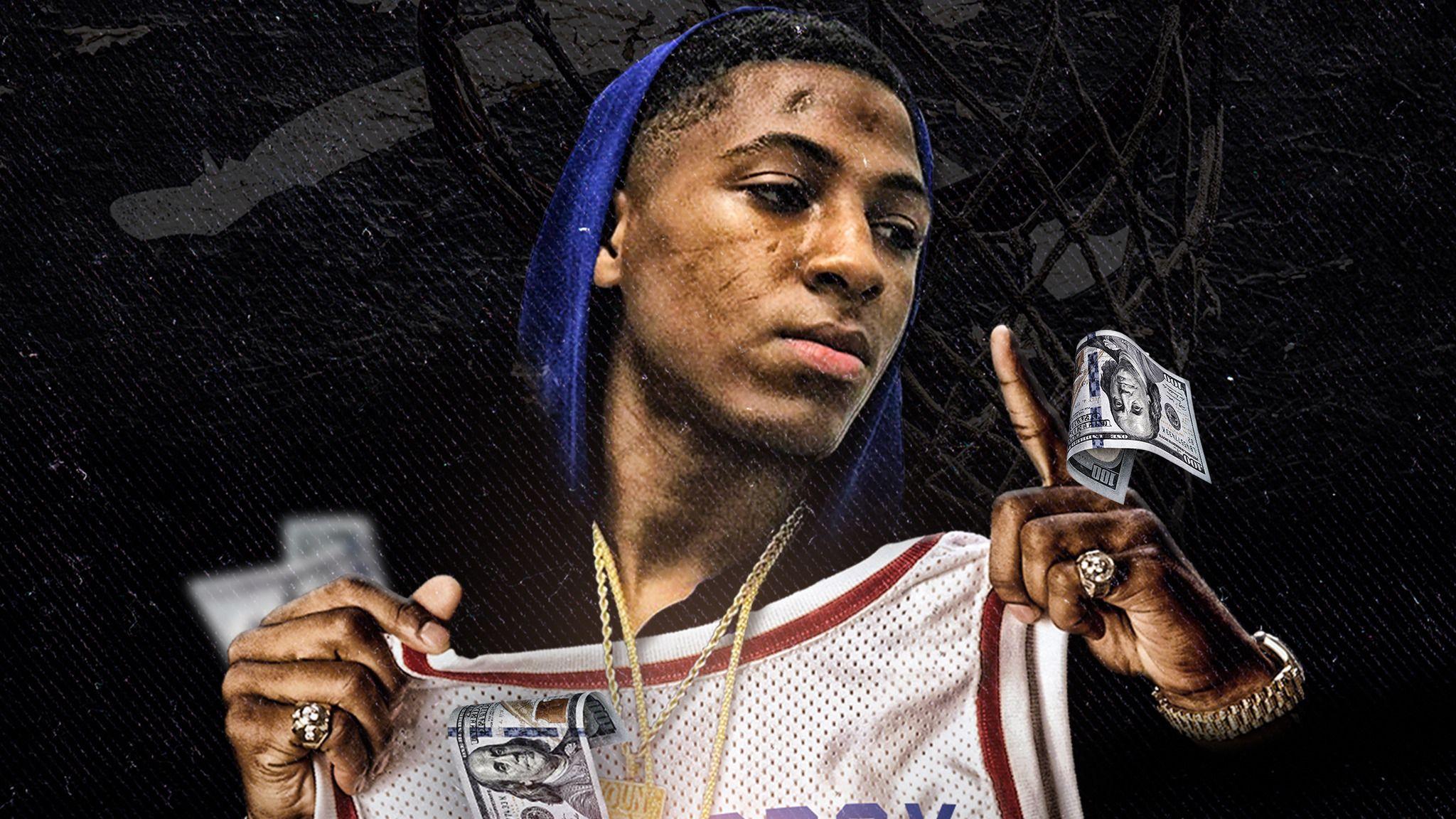
When you look at the visual history of Kentrell Gaulden, better known as NBA YoungBoy, color isn't just a stylistic choice. It's a language. If you've spent any time scrolling through his music videos or tracking his Instagram lives before the frequent deactivations, you’ve seen it. The specific shade of a bandana, the tint of a filter, or the lighting in a high-security mansion in Utah—it all means something. YoungBoy Never Broke Again colors are basically a roadmap of his shifting loyalties, his legal battles, and his mental state.
He’s a paradox.
He’s one of the most-streamed artists on the planet, yet he remains deeply tethered to the street codes of Baton Rouge. In that world, color is identity. It’s life and death.
The Baton Rouge Blueprint: Why Green and Red Dominate
Growing up in the Northside of Baton Rouge, specifically the 38th Street area, YoungBoy was shaped by a specific set of visual cues. People often get confused about his affiliations because he moves between different symbols so fluidly.
Let's talk about the green. For many fans, the "Never Broke Again" brand is synonymous with a specific forest or emerald green. It’s on the merch. It’s on the chains. It represents the money, obviously, but it also represents the "Northside" pride. It's a signal of growth and a refusal to go back to the poverty he experienced as a kid raised by his grandmother while his father served a 55-year sentence.
But then there's the red.
YoungBoy has frequently been associated with 4KT (4Krey), which carries heavy Blood affiliation. This is where the YoungBoy Never Broke Again colors get complicated. In videos like "Dead Trollz" or "Green Dot," the visual aggression is matched by the literal colors on screen. Red isn't just a fashion statement; it's a claim of territory and a warning to rivals.
Honestly, the way he uses color is almost cinematic. He’ll drop a video where everything feels washed out and grey when he’s feeling isolated, then pivot to vibrant, saturated primary colors when he’s in "Top" mode. It’s raw.
The "Colors" Mixtape and the Shift to Blue
In January 2022, YoungBoy released the mixtape titled, simply, Colors. This was a massive moment for his discography. If you look at the cover art, it’s a direct reference to his house arrest in Utah. You see him standing in the snow.
The color palette of that era shifted toward cold blues and stark whites.
Why?
Because he was isolated. The vibrant reds and greens of Louisiana were replaced by the "Blue" of the mountain shadows and the "White" of the snow. Fans noticed it immediately. The music on Colors felt different—more experimental, a bit more melodic, but still biting. Tracks like "Expensive Taste" and "Bring It On" showed a man trying to find his hue in a world where he was physically restricted.
There's a specific psychology to the blue imagery he used during his time in Utah. Blue is often associated with the Crip faction, and while YB has interacted with various sets, the use of blue in the Colors era felt more about "The Blues" in a musical sense. It was the color of sadness and legal stagnation.
He was stuck. He was rich, but he couldn't leave his yard.
Semantic Visuals: What the Different Flags Actually Represent
If you're trying to decode the YoungBoy Never Broke Again colors in his videos, you have to look at the flags. It’s not just a prop.
- The Green Flag: This is the "NBA" standard. It’s the color of the hustle. It’s neutral in the sense that it represents the business entity of Never Broke Again, but it’s fiercely loyal to the 38th Street roots.
- The Red Flag: This is the 4KT signal. When the red bandana comes out, the song is almost always a "murder song." It’s a high-energy, high-aggression signal.
- The White Flag: Occasionally seen in his more "emo" or vulnerable tracks. It’s not a sign of surrender, but rather a sign of purity or mourning. YoungBoy has lost a lot of friends to the streets, and white is often the color of the memorials.
People think he just picks what looks cool. That’s a mistake. Every frame is curated to speak to his "real" audience—the people who know exactly what those colors mean in the context of Southern street politics.
The "Gravedigger" Aesthetic and the Absence of Color
Sometimes, the most important YoungBoy Never Broke Again color is black. The "Gravedigger" persona he adopted is draped in shadows.
In the "Life Support" video, we see a much more muted palette. It’s earthy. It’s grounded. This is the version of Kentrell that is tired of the cycle. He’s wearing designer gear, sure, but the colors are suppressed. It reflects a man who is processing trauma in real-time.
A lot of the 2023 and 2024 content followed this trend. Even his house in Utah, as seen in various interviews (like the one with Billboard), is surprisingly minimalist. It’s not the flashy, neon-drenched aesthetic you’d expect from a 24-year-old millionaire. It’s beige. It’s grey. It’s quiet.
It’s almost as if the lack of color is his way of hiding. If you don't stand out, they can't find you.
How Fans Can Use These Insights
If you’re a fan or a creator looking to emulate the NBA aesthetic, you have to understand the balance. You can't just throw green and red together; you have to understand the tension between them.
When YoungBoy wears a certain color, his "slime" (his inner circle) follows suit. It’s a collective identity. When he dropped the Colors project, the fan art shifted overnight. The community began using those specific icy blues and high-contrast blacks in their edits.
It’s branding 101, even if it’s unintentional.
The most important thing to remember is that for YoungBoy, color is a mood ring. If the video is red, he’s angry. If it’s green, he’s focused on the bag. If it’s blue, he’s trapped.
Actionable Steps for Understanding the NBA Visual Style:
- Watch the "Dead Trollz" video: Notice how the red lighting creates a sense of claustrophobia and danger. This is the peak of his "Red" era.
- Analyze the "Colors" album cover: Look at how the white snow creates a "blank canvas" effect, symbolizing his fresh start (or forced isolation) in Utah.
- Track the Merch Drops: Notice how the "Never Broke Again" official clothing line uses a specific "Money Green." That exact hex code is the backbone of the entire brand’s visual identity.
- Observe the "Slime" Language: Pay attention to how the word "Slime" (often associated with the color green) is used interchangeably with loyalty.
YoungBoy’s use of color is one of the reasons he has such a cult-like following. It’s not just music; it’s a visual world that fans can inhabit. Whether he’s the "Gravedigger" in black or the "Top" in red, the colors tell the story that the lyrics sometimes can't.
Keep an eye on his next move. The moment the color palette of his social media or music videos changes, you’ll know exactly what kind of headspace he’s in before he even says a word. That’s the power of the YoungBoy Never Broke Again colors—they are the ultimate spoiler for his life.


