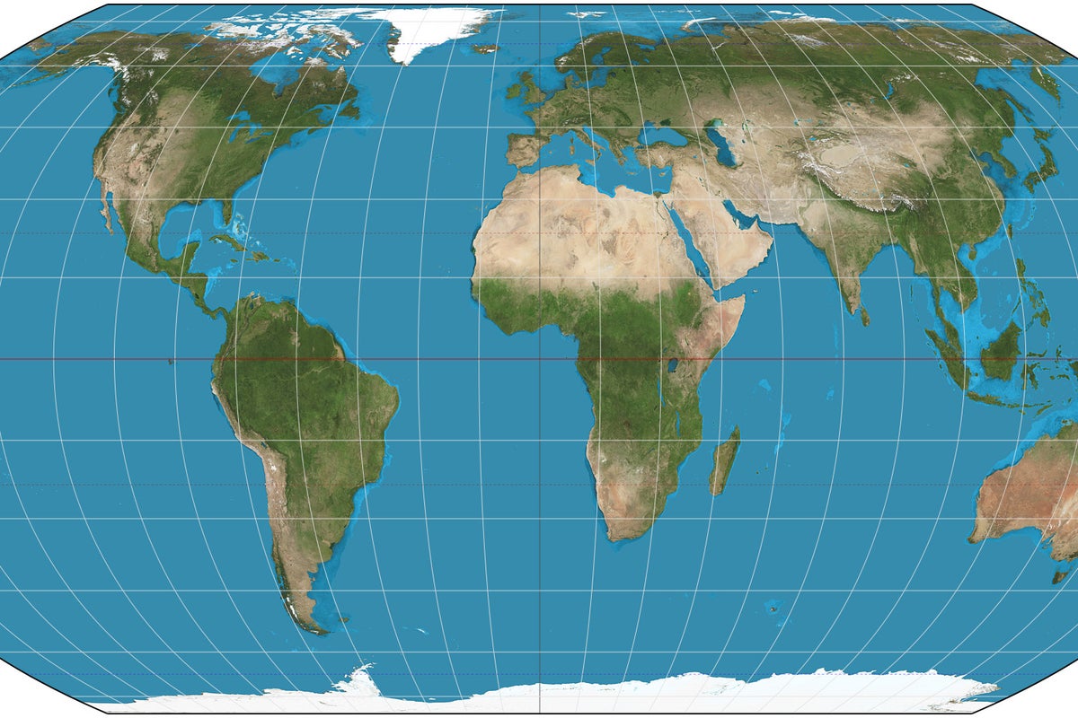
Every few years, someone on the internet discovers that Greenland looks roughly the size of Africa on a standard classroom wall chart and loses their collective mind. Headlines scream about colonial bias, eurocentrism, and geographical gaslighting. The narrative is always identical: the Mercator projection is a malicious tool of distortion, and switching to the Gall-Peters projection will finally liberate our spatial consciousness from the grips of cartographic imperialism.
It is lazy, performative outrage. And it misses the entire point of how math and navigation actually work. For an alternative view, see: this related article.
I spent a decade working with spatial data analysis and maritime logistics software, watching millions of dollars get squandered by corporate boards and municipal planners who demanded politically correct map projections while completely ignoring the physics of spatial distortion. They wanted the moral high ground of an equal-area map while trying to navigate tankers across an ocean.
Let us fix the broken premise of the entire debate right now. Related analysis regarding this has been provided by NBC News.
The Mathematics of the Sphere Are Irrelevant to Your Morals
You cannot flatten a sphere onto a piece of paper without stretching, tearing, or squishing something. This is not a political conspiracy authored by 16th-century Flemish cartographers; it is a fundamental law of differential geometry proven by Carl Friedrich Gauss through his Theorema Egregium.
Gerardus Mercator did not invent his 1569 projection to make Europe look large and important. He made it because sailors needed to draw a straight line on a flat chart and sail along a constant compass bearing without crashing into a reef. On a Mercator map, rhumb lines are straight lines. If you are steering a cargo ship through the North Sea at night, Mercator saves lives.
The critics screaming about Africa versus Greenland size comparisons are committing a category error. They are judging a navigational tool by aesthetic and political standards it was never designed to meet.
The Cartographic Trade-Off Matrix
| Projection Type | What It Preserves | What It Destroys | Primary Use Case |
|---|---|---|---|
| Mercator | Angles and local shapes | Area at high latitudes | Marine navigation, web mapping (Google Maps) |
| Gall-Peters | Relative surface area | Shape, angles, and human dignity | Political activism, school board virtue signaling |
| Robinson / Winkel Tripel | Visual aesthetic balance | Pure mathematical fidelity | General reference, classroom displays |
Notice what happens when you adopt the Gall-Peters projection to make landmass sizes look proportional. Africa looks correct, yes. But Europe and North America look like melted wax dripped down the sides of the page. Greenland is stretched out vertically until it resembles a giant, bleeding comma. Indonesia is warped past recognition.
Every map projection is a compromise. You choose what to distort, because distortion is mandatory.
The Web Mercator Conspiracy You Missed
While activists waste their breath complaining about school textbooks, the entire digital economy quietly standardized on the most aggressive distortion engine ever conceived: Web Mercator.
Every time you open Google Maps, Apple Maps, or Uber on your phone, you are looking at a pseudo-Mercator projection. Web Mercator cuts the globe off at eighty-five degrees north and south because it refuses to compute the infinite stretching required to show the poles. It treats the Earth as a perfect square.
If you zoom out on a digital mapping app, northern locations like Alaska and Scandinavia inflate to absurd, monstrous proportions compared to Brazil or the Democratic Republic of Congo. Yet nobody protests outside Silicon Valley tech campuses over this. Tech companies adopted Web Mercator because tiling flat square images makes server processing infinitely faster. Math and server latency trumped political sensitivities every single time.
If we truly cared about geographical equity in our digital infrastructure, we would demand that tech giants render every consumer routing app on a dynamic three-dimensional globe rather than a flat web tile. But we do not. We prefer the cheap dopamine hit of complaining about a sixteenth-century navigation chart while staring at a twenty-first-century Web Mercator screen.
The Real World Isn't Flat
The obsession with fixing flat maps stems from a deeper cultural illness: our insistence on forcing three-dimensional complexity into two-dimensional visual boxes.
When politicians and commentators obsess over the visual weight of continents, they treat geography as a painting rather than a dynamic theater of resources, trade routes, and climate systems. Greenland might look massive on a Mercator grid, but try growing crops on an ice sheet. Size on a flat paper sheet means nothing in the calculus of global power. Singapore is a tiny speck on every map ever printed, yet it wields more economic leverage than entire continents.
Stop looking at wall charts to find your geopolitical validation.
If you want to understand spatial reality, throw away the static paper map. Rotate a globe. Look at orthographic projections centered on the Arctic or the Southern Ocean, where international trade actually converges. Realize that distance in the modern world is measured in flight hours and fiber-optic latency, not square inches of continental real estate.
The map is not the territory. And your outrage over the projection is just a distraction from your refusal to read the coordinates.